Redesigning Netflix's Homepage: "Choose My Night"
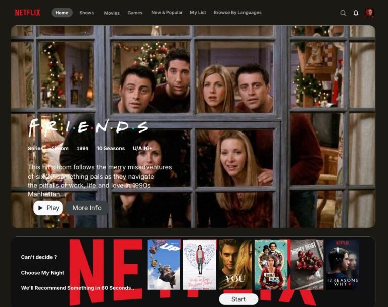
- This is a self-initiated concept project, not commissioned or affiliated with Netflix – an excercise in identifying a real UX problem and designing a considered solution for it
Overview
“Choose My Night” is a Netflix UX redesign concept that reimagines the streaming homepage as a short, guided decision flow instead of an endless browse grid. Netflix holds one of the largest content libraries in streaming, yet one of the most common complaints from users is that they spend more time scrolling than actually watching. This concept addresses that problem directly, guiding users through a quick set of choices that leads them to a confident pick in under a minute.
The Problem
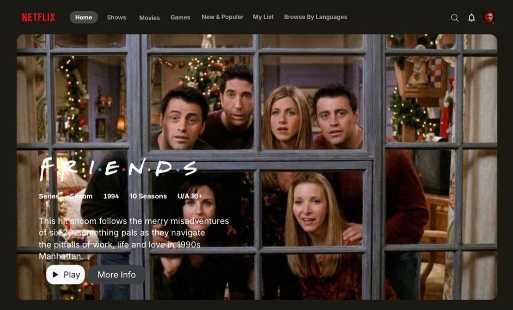
Netflix’s current home experience is optimized for browsing, not deciding. Rows of thumbnails (“Trending Now,” “Because You Watched…”) are great for discovery, but they put the entire cognitive load of choosing on the user. For someone who just wants to watch something tonight, this creates classic decision fatigue: more options, more scrolling, more time before anyone actually presses play.
What if Netflix did the deciding with you, instead of just showing you more choices?
Goals
- Reduce the time between opening the app and pressing play.
- Make recommendations feel personal and explainable, not just algorithmic.
- Keep the flow lightweight. This should feel like a fun 60-second quiz, not a form.
- Preserve Netflix’s existing visual language so the feature feels native, not bolted on.
Process
I started from Netflix’s existing homepage to identify the natural entry point for this feature, then mapped the shortest possible path from “I don’t know what to watch” to “here’s your movie.”
01 Entry Point
A “Choose My Night” module sits in the homepage feed, right where a content row would normally go, so it doesn’t require new navigation or a separate destination. It’s framed with a low-commitment hook: “We’ll recommend something in 60 seconds.”

02 Prefernce Capture
Rather than one long form, I broke preferences into a short, scannable pop quiz:
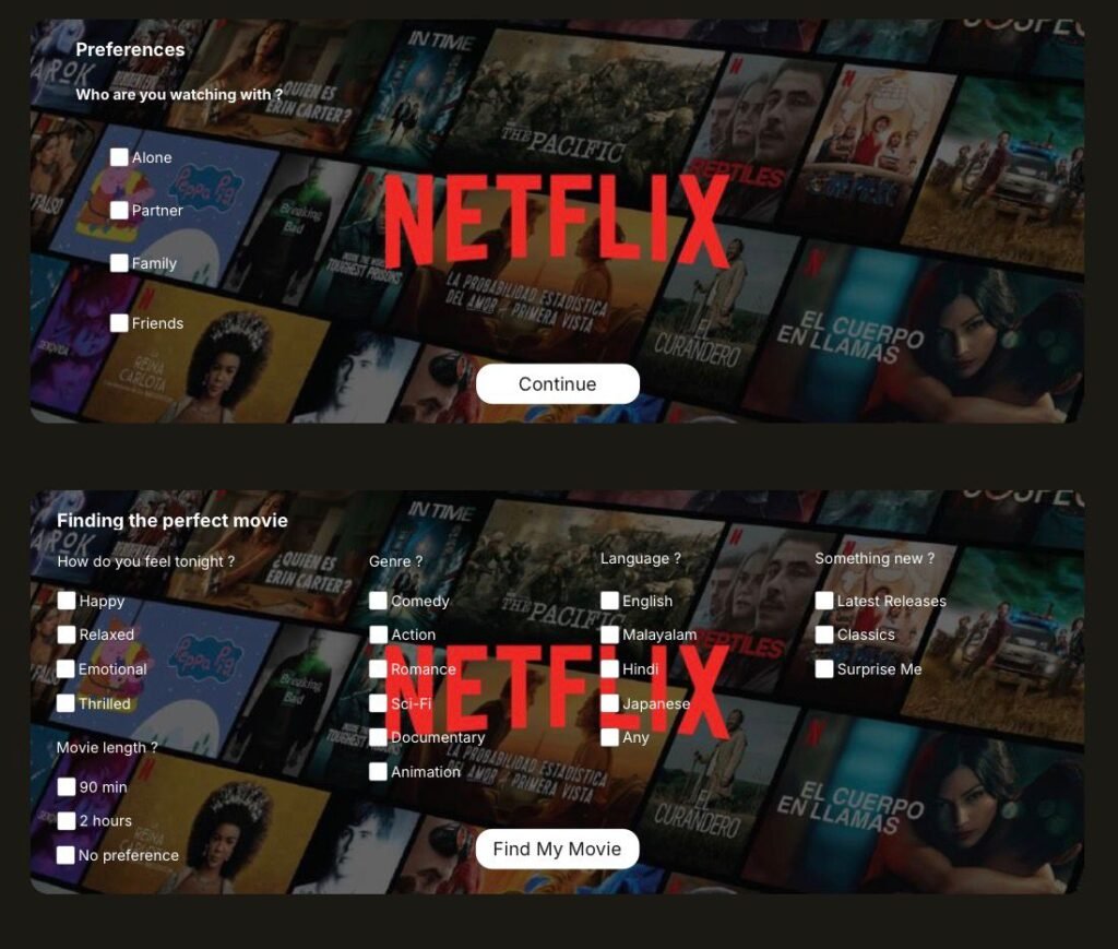
- Who are you watching with? (Alone, Partner, Family, Friends)
- How do you feel tonight? (Happy, Relaxed, Emotional, Thrilled)
- Genre, language, and runtime.
Each question uses simple checkboxes with familiar Netflix iconography, so nothing feels like a new interaction pattern to learn.
03 Recommendations with Reasoning
The results screen shows three curated picks with match scores, but the key decision was adding a “Why we picked this” checklist (Matches your mood, Fits your preferred runtime, Similar to movies you’ve enjoyed) on the detail page. This turns the recommendation from a black box into something the user can trust, and it directly reuses Netflix’s existing “% match” pattern so it reads as an extension of a system users already understand.
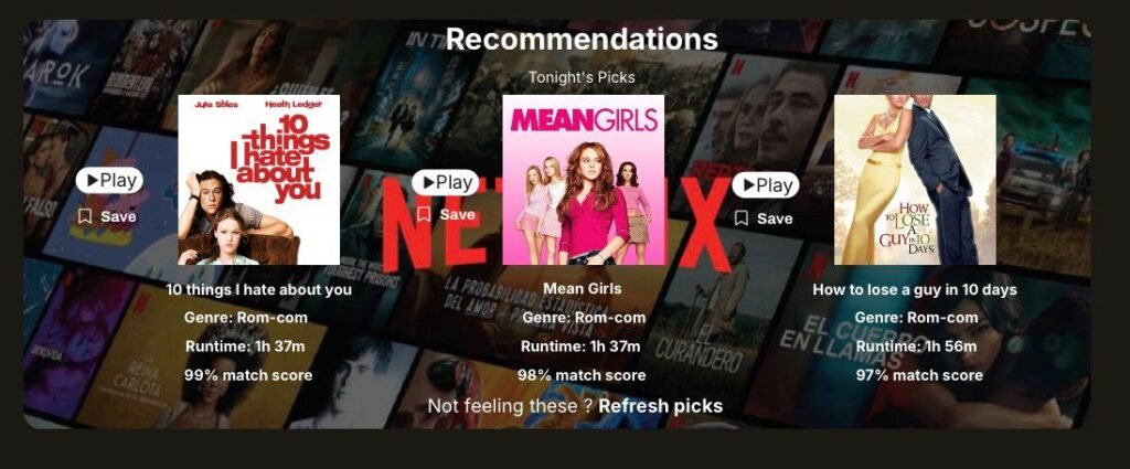
A “Refresh picks” link on the result screen and a persistent path back to browsing mean the feature never traps the user. If the quiz doesn’t land, they’re one tap from where they started.
Key Design Decisions And Why
Decision
Embed the module in the home feed instead of a new tab.
Group questions instead of one long form.
Reuse Netflix’s match-score and detail page patterns.
Add “Why we picked this” reasoning.
Why
Zero learning curve, no added navigation.
| Keeps momentum, avoids long-form fatigue |
Feels like a native feature, not a redesign of the whole app.
Builds trust in the recommendation instead of asking users to take it on faith.
Outcome
A Netflix UX redesign concept using a guided “Choose My Night” feature to cut decision fatigue and boost engagement; the result is a short, guided path: home feed → mood/preferences → ranked recommendations with reasoning → play. It’s a low-risk, high-value feature concept; it doesn’t require reinventing the interface, just adding a smarter front door to the content that’s already there.
Reflection
The hardest part of this project was resisting the urge to add more questions. Every extra field increases the odds someone abandons the flow before getting a recommendation, so the real design work was in cutting the quiz down to the smallest set of inputs that still produces a result that feels personal.